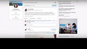
Microsoft-owned LinkedIn finally has a brand new desktop design. And it was high time! In the company’s words, the new look is the “largest desktop redesign since LinkedIn’s inception.” LinkedIn has streamlined features and given it a similar look and feel to the overhauled app design, which was changed in December last year.
According to the company, the new the design is now built on a single-page application, which enables a more application-like experience. It has been broken down into seven sections for navigation: Home, messaging, jobs, notifications, me, my network, and search.
LinkedIn has also brought in a new real-time messaging interface, which allows users to message connection. The company said, “We’ll also start serving up insights across the site to help you break the ice in any conversation and connect you to your next opportunity.”
You will also have the option of one universal search box – help users find people, jobs, companies, groups and schools. You can see who is reading and engaging with the content you share, including the company, job title and location of the people who are interested in your updates. The company has also improved profile suggestions so users can more easily see what they need to do to look good professionally, for example, suggested skills based on what recruiters are searching for.
Source: http://www.dnaindia.com/


